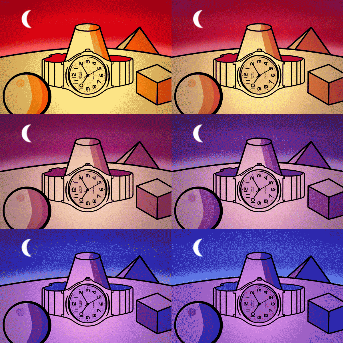
Sometimes we stumble upon a written piece that ends up being a map to an unexpected adventure. One morning as I was browsing horological websites, I came upon the article Hands-On with the (Often) Cheapest Watch on Amazon, written by HODINKEE Editor in Chief Jack Forster. Forster is referring to the Casio EAW-MQ-24-7B2 quartz watch. But don't judge this book by its cover or its $15.00 price point. There's a lot to discuss about this humble timepiece, especially if you are a graphic designer like me.
Obviously, this watch isn't a horological masterpiece. It's on the other end of the haute horology spectrum. The retail price of the movement is only a few dollars, it has no complications, and it's made almost entirely of plastic. However, what it lacks in precious materials it makes up in utility.
The watch’s unisex, lightweight design makes it a perfect "everyday" watch. It does have some form of water resistance, although the exact depth isn't stated. It simply reads “water resist” on the dial. It comes with a two-year warranty, a testament to the engineering bravado of the timepiece. The dial is easy to read thanks to the font used for the numbers: Handel Gothic.
Handel Gothic is a sans serif font created in 1965 by Donald J. Handel. It not only works well on inexpensive wristwatches but has a proud history of use in movies, television, and other industries. It was the movie poster and title screen font for Close Encounters of the Third Kind. It was used in the Star Trek TV series Deep Space Nine and the logos for Pepsi and Volvo. It was even used in ventures overseas for broadcasters in Germany and Korea. In my own design work, I’ve enjoyed using the bold, futuristic vibe that Handel Gothic provides.
Typography (the appearance of text) is often referred to as an invisible art, but in reality it’s not unseen, just frequently not recognized. A timepiece offers a unique opportunity to showcase a font, since there is so little space to communicate a rather sophisticated amount of information. Not only does the font need be legible, but it also should reflect the personality of the piece. I have seen brilliant uses of fonts on timepieces that made me want to own them on that merit alone. For this Casio watch, Handel Gothic is the perfect font.
Forster’s article not only provides a golden typographical nugget to savor, it also muses on hidden intelligence and finding delight in even the humblest creation. The article lives on in the comments (a statement that I thought I’d never write). There I found funny and insightful remarks, references to sci-fi novels I’ve never heard of and can’t wait to read, and appreciation for a well-written piece.
The next time you are on the hunt for a new timepiece, take a minute to really examine the font used on a watch or clock dial. Ask yourself, “Where have I seen this font before? How does it make me feel?” ” I certainly had fun learning about Handel Gothic, a font that I’ve seen and even used but didn’t truly know. Check out Forster’s article and read the comments to see where it might take you.

