In the early 1990s the Internet wasn’t much to look at. It was primarily tables, text, and hyperlinks that led to even more tables, text, and hyperlinks. Back then, magazines and newspapers were the primary media to promote wristwatches. The Internet’s slow download speeds and chunky bitmap graphics were no match for huge, full-page ads in newspapers or the high-definition, richly inked, glossy-page magazine folios. This dichotomy, as you know, changed as the Internet and the technology supporting it matured.
For those of us who have survived the print-to-electronic diaspora, the transition to online continues to be a challenge. That’s why it was so surprising when wristwatch wundersite HODINKEE decided to print a magazine. I couldn’t imagine that we, here in the NAWCC Publications Department, were the only ones asking why the world’s leading Internet-borne source of wristwatch news would decide to print a magazine. It almost seemed as if they were trying to be ironic, even grandiose. But in truth, it is an adoration of the art form of print. It is a thoughtful piece of design that every horological publisher should observe.
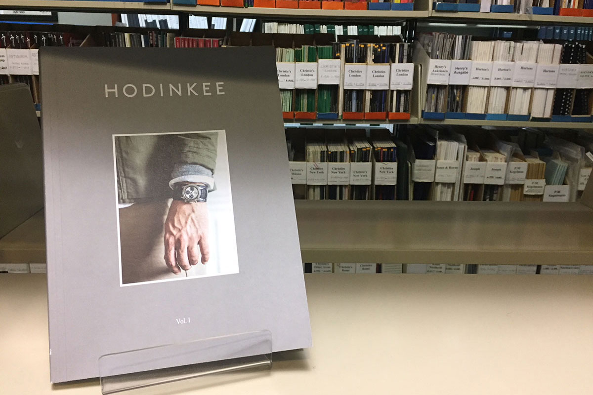
Let’s start with the presentation and design of the magazine itself before discussing content. This volume with 160 semi-gloss pages is bound with a technique called lay-flat binding, which allows the book to lay more flat, offering better protection to the spine. The silk cover is matte grey with raised HODINKEE lettering. Centered in the middle, like an island in a grey sea, is a photograph of a gentleman wearing Paul Newman’s Rolex Daytona 6239. In contrast to the tasteful yet desaturated photo on the front cover, the back hypnotizes with a red and gold, richly colored advertisement of a Tank Louis Cartier.
In the forward of Robert Bringhurst’s famous book, The Elements of Typographic Style, the author describes typography as both making historical and visual sense. HODINKEE Volume 1 achieves both. Fonts used inside the book are Portrait Text Regular as the main body copy with pull quotes done in Brown Pro Web Regular. Paragraphs are ragged right, 9 point font size separated by spaces in between them. Most photos are surrounded by generous margins of white space. These combined elements give a welcoming, wide-open reading space to peruse. With the exception of the smaller font size and, surprisingly, the missing use of Brown Pro Portrait Inline Sans in article headlines, the book reflects the same graphic elements as the HODINKEE website.
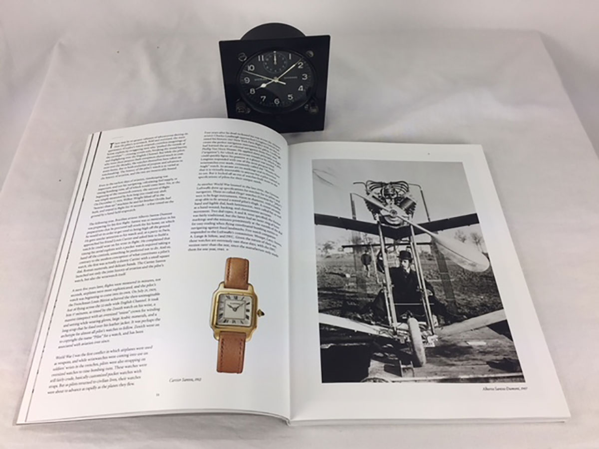
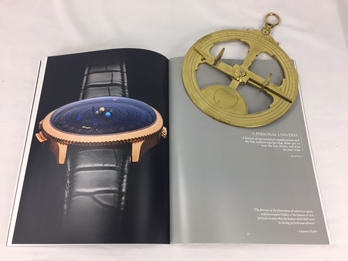
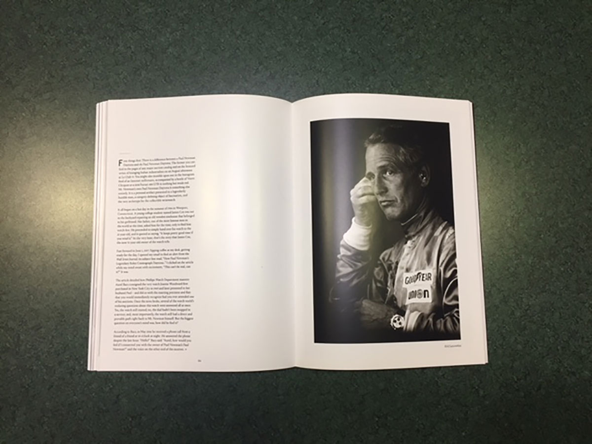
Concerning the actual content, the magazine covers a range of horological topics of varying intensities. Jason Heaton’s lead article, “Up in the Air,” serves as a concise history of early aviation, the pioneering pilots, and the timepieces that aided them. In “Why I Collect” three world-famous professionals share their earliest yearnings for the wristwatches they love. Jack Forster flexes his horological acumen in “A Personal Universe” by exploring a range of astronomical timepieces from the humble moonphase wristwatch to the most complicated astronomical watch of them all—Vacheron Constantin’s Les Cabinotiers Celestia. And Cara Barrett regales the long and winding epic of how Paul Newman’s Daytona became the most expensive wristwatch ever sold.
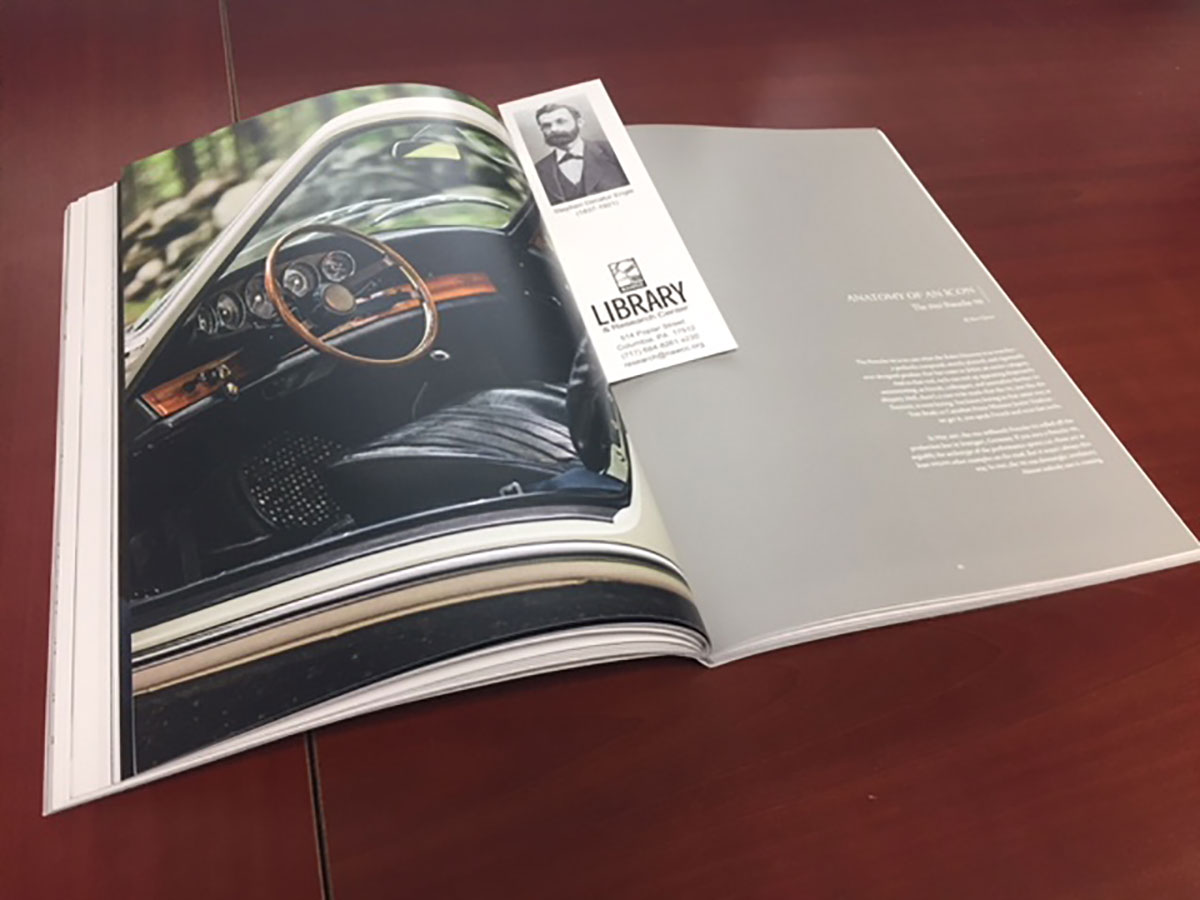
Of the 17 features listed in the table of contents, three are not related to horology. It is surprising that “Anatomy of an Icon,” written by founder of HODINKEE Ben Clymer, about the industry-defining 1965 Porsche 911, is one of them! The best explanation for this cavalier act can be found stated on their website, “The HODINKEE Magazine allows us to tell stories that might not fit right here on the good old dot com for one reason or another. Whether it’s that they require a different visual language, aren’t exclusively about watches.” Clymer’s editorial approach to the watch industry has always leaned on the emotional stirring that wristwatches can evoke with the perfect amount of authority and technical knowledge. “Anatomy of an Icon” demonstrates that HODINKEE is no longer a voice just about wristwatches but of haute culture and appreciation of the lifestyle.
The weakest feature of Volume 1 is John Mayer’s interview with Patek Philippe CEO Thierry Stern. Although the interview is insightful, Mayer gets in the way of himself by comparing and contrasting too much of his career with Stern’s. These two professions couldn’t be more different. I’m a fan of Mayer’s music and I certainly don’t expect him to not mention something about his life, but I want to hear Stern’s music when he’s on stage.
HODINKEE Magazine Volume 1 is an excellent addition to any watch lover’s library. The variety of horological topics are bound to please both novice and veteran alike. It’s is a wonderful work of design with excellent content. King of Prussia Frederick II said that artillery adds dignity to what would otherwise be a vulgar brawl. In the vulgar brawl of life, wristwatches certainly add a level of dignity, and this book fits nicely as part of the attaché.